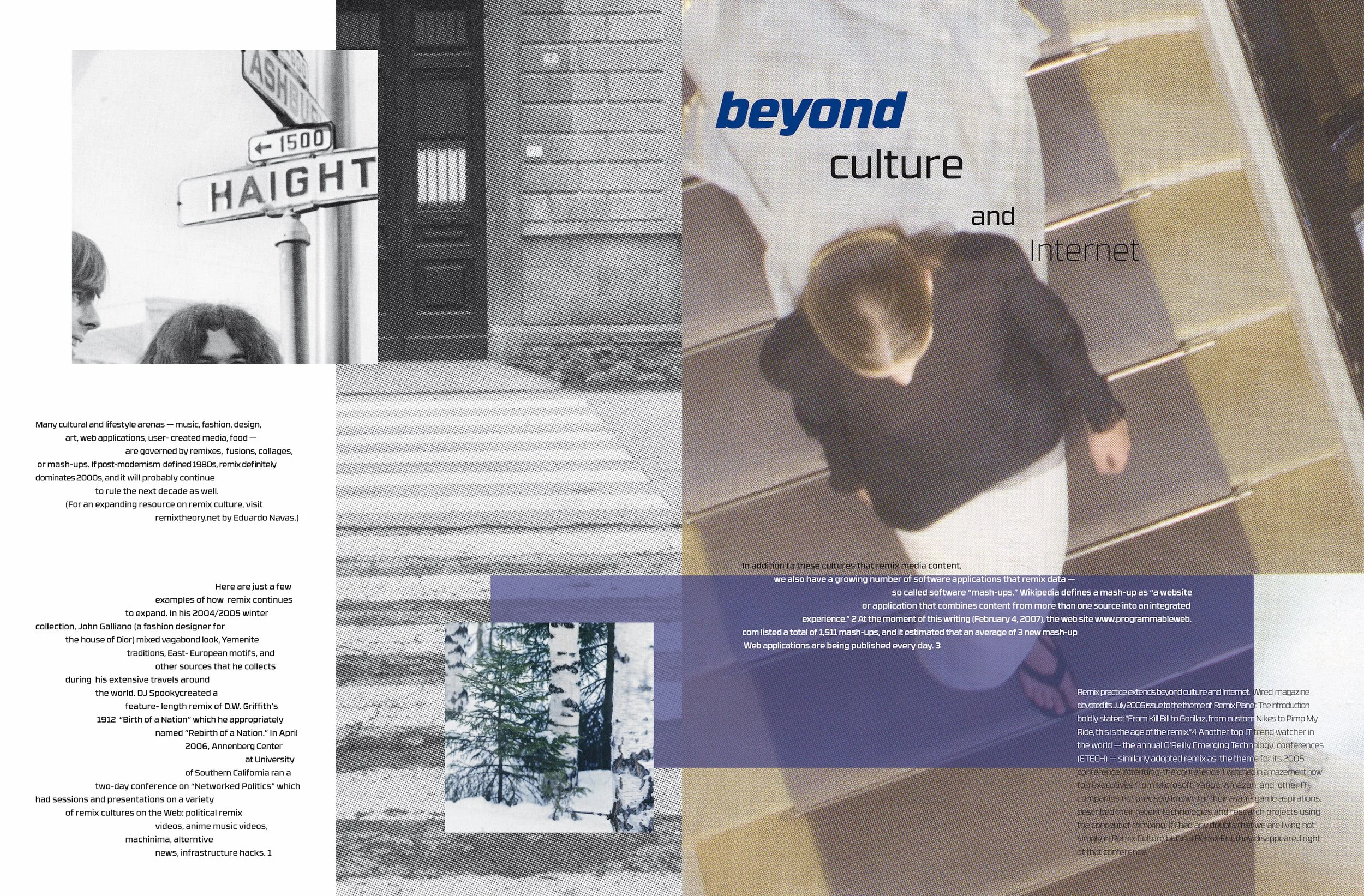
"What Comes After Remix?" was a project that combines the art of typography, layout, composition, and cut-out images from magazines. It has been one of my favorite projects to date.

"What Comes After Remix?" was a project that combines the art of typography, layout, composition, and cut-out images from magazines. It has been one of my favorite projects to date.

This is a collection of short stories that educators wrote. These stories highlight the adventures and emotions that all take place in the city of Chicago.
I own the rights to all original photography.

This is a collection of short stories that educators wrote. These stories highlight the adventures and emotions that all take place in the city of Chicago.
I own the rights to all original photography.

This is a collection of short stories that educators wrote. These stories highlight the adventures and emotions that all take place in the city of Chicago.
I own the rights to all original photography.

I started The Gift of Giving Co. with my sister back in 2017. Our goal was to sell Holiday items because we love the season so much. A year later, we realized a need to produce Holiday items that represented Latinx culture, and we’ve been thriving ever since.
This layout is from the first year we started making handmade items, specifically felt poinsettia napkin rings.
I own the rights to all original photography.

This layout is from the first year we started making handmade items, specifically ornaments matching our gift tags designs. Additionally, I designed the logo, which remains our logo today.
I own the rights to all original photography.

This project had to combine a specific font with the film. In this case, I was given Akzidenz-Grotesk BQ with the classic thriller, Psycho. I designed the top half of the book to show the sequence of the movie. The lower half of the book informed the reader about the history of the typeface.
This cover includes photographs from the movie and a manipulated stylization of the film's title.

The bottom of this layout showcases this textures panel, which is an image of a trashbag. It was fantastic to combine a scanned image of a trashbag versus a digital texture photograph. I thought it would bring a sense of eerieness to the layout, a prominent theme in Psycho.

Throughout the book, I presented the film characters as square shapes to represent a “trapped” or “can’t escape” energy to the overall composition. If you are familiar with the plotline, Norman Bates is trapped in this multi-personality reality he has created from himself, along with guests who are essentially stepping into the story as victims.

Throughout the book, I presented the film characters as square shapes to represent a “trapped” or “can’t escape” energy to the overall composition. We see this woman face to face with a mysterious figure (her murderer) while showering in this scene. I wanted this layout to convey that events are falling apart within the movie's plotline. First, I created this image through my software and then printed it out. Afterward, I organically ripped up the printed page, scanned the pieces, and made this particular layout.